
Countdown Timer
The module renders a countdown timer with extensive configuration options. Core settings allow specifying the target date, defining the number of timer repetitions, and setting the duration in minutes for each cycle. The system supports time zone selection, adjustable width for the display area, and control over spacing between text groups and individual time digits.

Circular countdown timer
The module renders a circular timer with extensive configuration options. Timer settings: - Selection of operation mode: countdown timer or specific date display. - Setting the target date for date mode. - Setting the number of seconds for timer mode. - Defining the width of the timer area (in adaptive mode, it uses the maximum available width).

Lightbox, Fancybox
The module implements lightbox functionality for image zooming and is compatible with the Fancybox 2 library. The solution supports a multi-site environment, allowing the selection of a specific site for applying settings. Users can manage external dependencies by enabling or disabling the jQuery library, the mouse wheel handling module, and the Easing animation library.

Photo Album - Adaptive Photo Gallery with Albums
The module adds Lightbox-style image scaling functionality to the photo album. Settings are divided into two groups. In the general parameters, you can select a specific site for the module to operate within a multi-site environment. Toggles are also available to connect external libraries: jQuery, a mouse wheel handling library, and the Easing animation library.

Extended AJAX feedback form
Module for an extended feedback form that sends messages to E-mail via AJAX. The package includes 11 built-in design templates. General settings allow enabling or disabling the jQuery library, as well as enabling libraries to support the PLACEHOLDER feature in older versions of Internet Explorer and to add an input mask for the 'Phone' field.

Adaptive slider
The component displays a list of news items from an information block section as an adaptive slider. It provides news feed viewing and navigation through the list. All settings available in the standard 1C-Bitrix News List component (news.list) are supported, including sorting, selected fields, information block selection, date format, number of news items per page, and other options.

Adaptive partner slider
The component displays a list of news items as an adaptive slider. It provides viewing of data from an information block and navigation through the news feed. All content management parameters match the standard 1C-Bitrix news.list component: sorting configuration, selection of displayed fields, definition of the information block, date formatting, and the number of news items per page.

Adaptive slider with parallax effect
The adaptive slider with parallax effect displays a news list from an information block as a slider. The component provides news viewing and navigation through the list. It supports all settings of the standard 1C Bitrix news.list component, including sorting, field selection, information block definition, date formatting, and the number of displayed news items.

Interactive News Slider
The interactive news slider displays a list of items from an information block in slider format. The component provides news viewing and navigation through the list. It supports all settings of the standard 1C-Bitrix news.list component, including sorting, field selection, information block definition, date formatting, and the number of displayed items.

News list with 3 effects
The module renders a news list from an information block with visual effects. Functionality includes standard features of the 1C-Bitrix news.list component: sorting configuration, selection of displayed fields, information block definition, date formatting, and page news limit. Flexible container settings are provided.

News list with effects
The component renders a news list from an information block with visual effects. It fully supports all settings of the standard 1C-Bitrix news.list component, including sorting, field selection, information block definition, date formatting, and items per page. Container type can be configured as fixed width with a 1170-pixel limit or full-width spanning the screen or parent block.

Adaptive 3D Slider
An adaptive 3D slider for displaying a news list from an information block. The component supports news navigation and inherits all settings from the standard 1C-Bitrix news.list component, including sorting, field selection, information block definition, date formatting, and the number of items per page. Slider settings include two built-in templates.

News Carousel
The component displays a news list from an information block as a carousel. It provides news viewing and list navigation. All parameters of the standard 1C-Bitrix news.list component are available for configuration, including sorting, output fields, information block selection, date format, and the number of news items per page.

Interactive map of offices and objects on Yandex.Maps
The component displays offices and objects on a Yandex Map using data from an information block. Settings allow control over map behavior and marker appearance. You can enable or disable loading the Yandex Maps library, map dragging, and zooming via mouse wheel, double-click, or right-click. Map dimensions are set via CSS.

KS Cookie — Cookie usage notification
KS Cookie is a module for 1C-Bitrix designed to display a Cookie usage notification on a website and obtain user consent. The module automatically shows a compact banner on the public part of the site and saves the user's choice in a Cookie. Once consent is given, the banner does not reappear for the specified duration.

News list with effects 2
The "News List with Effects 2" module by KS Web Studio renders a news feed from an information block with visual animations. The component fully supports parameters of the standard 1C-Bitrix news.list module. Sorting, selected fields, information block selection, date formatting, and the limit of records per page can be configured. Flexible container settings are implemented.

News list with effects 4
The component renders a news list from an information block with visual effects. It includes all standard features of the 1C-Bitrix news.list component: sorting, field selection, information block selection, date formatting, and the number of news items per page. The output container offers flexible configuration.

News list with effects 5
The KS Web Studio module 'News List with Effects 5' displays a news feed from an information block. Its functionality includes all options of the standard 1C-Bitrix news.list component: sorting, selection of displayed fields, information block definition, date formatting, and page record limits. The component offers 20 built-in templates with visual effects.

News list with effects 6
The module displays a news list from an information block with visual effects. It includes all settings of the standard 1C-Bitrix news.list component: sorting, field selection, information block definition, date formatting, and page item limits. The component offers 15 built-in templates with various effects.
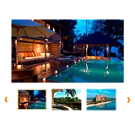
Interactive image slider
The interactive image slider provides a convenient way to view a collection of images from the media library. The component is fully adaptive and displays correctly on all device types. Features: - Viewing a collection of images from the media library. - Circular strip of image thumbnails. - Ability to place multiple independent instances on a single page, each with individual settings.

News list with effects for circular elements
The component displays a news list with animation effects from an information block. It implements the full set of settings available in the standard 1C-Bitrix news.list component: sorting, selection of displayed fields, choice of the information block, and the number of news items per page. The container supports a fixed width (maximum 1170 pixels) or full width of the screen or parent block.

Button to return to the top of the page. Up/Top button
The Page Return Button module adds a floating button to the site, allowing visitors to quickly return to the top of a long page with a single click. The button appears after scrolling down and smoothly scrolls the user to the top.